Painting and decorating a room might seem as simple as choosing a favourite colour and grabbing a brush. However, many homeowners fall into common traps that lead to lasting painting mistakes and decorating problems. These issues often go beyond colour and stem from a lack of planning and understanding of how each element in a room works together.
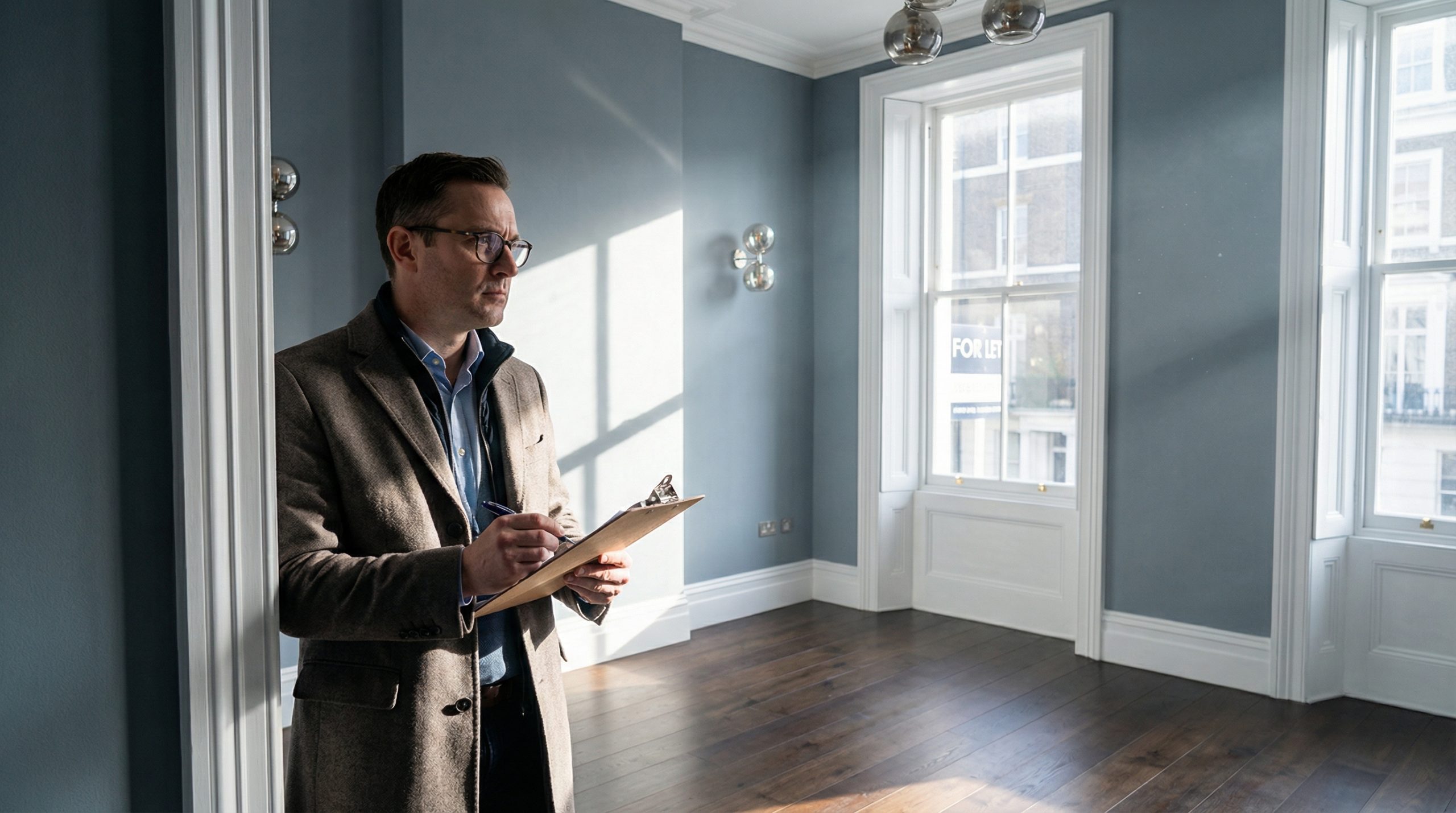
One of the most frequent interior design mistakes is picking paint colours in a rush. Colours look different under various lighting conditions, and what appears perfect in a store may feel too dark or dull at home. Tools like the Benjamin Moore Color Portfolio app help homeowners test tones in real spaces before making a final choice. With 2025 trends leaning toward rich, saturated hues like Cinnamon Slate and Purple Basil, it’s easy to be swayed by beauty without considering compatibility with existing décor.
Another critical error is ignoring the influence of light. Poorly lit rooms can make even the most stylish shades feel flat. A warm paint tone may appear cold if natural light is limited. This creates a chain reaction of home decor mistakes, where wrong lighting leads to wrong colour choice, and that in turn impacts the entire mood of the room.
Also, many people overlook the role of furniture and layout. Applying a bold colour without adjusting for scale or spacing can make a room feel cramped. This ties into furniture placement mistakes and room layout mistakes, where the flow of the space is not taken into account. The result? A room that feels off-balance, no matter how elegant the paint.
To avoid these common decorating errors, follow these simple guidelines:
- Test paint samples in different lighting at various times of the day.
- Use colour palette tools to coordinate wall shades with furniture and flooring.
- Consider how furniture arrangement impacts colour perception and room feel.
- Pay attention to current trends, but adapt them to your own space and lighting.
When overlooked, these early decisions can lead to costly home improvement mistakes. That’s why it’s important to start with a plan and not just a colour chart. Identifying these missteps early can save time, money, and disappointment.
By focusing not just on colour, but on how it interacts with light, layout, and furnishings, you can avoid hidden painting decorating mistakes and create a space that works beautifully in both form and function.
Next, we’ll explore why preparation is everything—and how skipping surface prep can lead to some of the most avoidable painting problems.
Surface Preparation Slip-Ups: Preventing Foundational Painting Mistakes
 One of the most common painting mistakes happens before the brush even hits the wall—poor surface preparation. Skipping this step leads to peeling paint, uneven finishes, and wasted time. It sets the stage for bigger problems later, especially with today’s bolder colour trends like Cinnamon Slate or Brick Red that demand clean, even surfaces.
Many DIY painting mistakes start when people overlook dents, cracks, or old flaking paint. Applying fresh paint directly over faults traps imperfections and makes them stand out more. These errors become especially visible with high-sheen finishes or bold tones.
To prevent these common wall painting mistakes, follow a few key steps:
- Clean surfaces thoroughly to remove grease, dust, and old residue.
- Sand uneven areas for a smooth base—this is vital with layered colour effects or gloss finishes.
- Apply primer, especially when painting over dark colours or bare plaster.
- Use filler for cracks or holes, and allow proper drying time before painting.
Neglecting these basics won’t just affect the look—it can shorten the life of your paint job. In commercial or high-use spaces, poor prep often leads to painting problems like bubbling, chipping, or staining within months.
Citywide Maintenance Solutions sees these issues frequently when called to fix interior painting mistakes. That’s why our certified painters follow a strict prep checklist, ensuring surfaces are ready for long-lasting results. Our team knows that the best finishes depend on solid groundwork—especially when working with modern techniques like colour drenching or wallpaper-style effects.
Once you’ve prepped your surfaces properly, the next step in avoiding common painting errors is selecting the right colour—and finish—for your space. Let’s explore how to avoid the costly impact of paint color mistakes in the next section.
Choosing Paint Colours and Finishes: Avoiding Costly Paint Color Mistakes
 Choosing the right paint colour and finish affects more than just style—it impacts how a space feels and functions. Many paint color mistakes come from guessing or rushing, not from lack of taste. People often pick colours under artificial light or from swatches that don’t reflect real-life conditions.
In 2025, colours like Cinnamon Slate and Purple Basil are in trend. But rich tones need the right surroundings to shine. If lighting or layout clashes, the colour won’t look right once applied. That leads to costly interior painting mistakes that require repainting or redecorating sooner than planned.
It’s not just about colour, either. The paint finish changes how the room looks and feels. A high gloss can highlight flaws, while a matte finish may dull darker shades. These are often overlooked painting decorating mistakes.
To avoid these common painting errors, keep these points in mind:
- Test colours on different walls at different times of day.
- Choose finishes based on light levels and surface condition.
- Coordinate wall colours with fixed features like flooring and cabinetry.
- Use tools that let you preview combinations, like digital visualizers.
At Citywide Maintenance Solutions, we guide clients through smart colour planning. Our decorators understand how hue, lighting, and texture work together. We prevent common home decor mistakes by balancing vision with what a room can support.
We’ll help you match colours and finishes to your space—not just the latest trend. That way, your look holds up in both style and durability.
Once colour and finish are set, the next challenge is applying it properly. Let’s look at how to avoid painting problems by using the right tools and techniques.
Applying with Precision: Common Painting Errors in Technique and Tools
 Even with the perfect colour and finish, painting decorating mistakes still happen if the wrong tools or techniques are used. Many DIY painting mistakes start here. The results? Uneven coverage, visible brush marks, or roller lines that take away from the intended look.
In 2025, popular techniques like color drenching and gloss layering demand careful application. Using a low-quality brush or the wrong roller nap can cause streaks, especially with rich colours like Purple Basil or Brick Red. These painting problems often stem from using the same method across different wall types.
To avoid these common painting mistakes, match the tool to the task:
- Use angled brushes for corners and trim to prevent smudging.
- Choose rollers with the right nap length based on wall texture.
- Never overload the roller with paint—this causes splatter and patchiness.
- Apply paint in clean, even strokes with steady pressure.
Another issue? Rushing through coats. Skipping drying times between layers leads to bubbling or cracking. Some think more paint means better coverage, but this adds weight and weakens adhesion—classic interior painting mistakes.
Our team at Citywide sees these avoidable mistakes often. That’s why we focus on proper techniques and high-quality tools for consistent results across all surfaces. Whether it’s a matte nursery or a high-shine hallway, each finish needs a different method for best effect.
Precision in painting sets the visual tone for a space. But what pulls the entire room together? Furniture placement, layout, and lighting. Next, we’ll look at how these overlooked details lead to surprising decorating problems.
Beyond the Brush: Decorating Mistakes in Lighting, Layout, and Furniture Placement
 Painting can transform a room’s mood, but poor decorating choices often undo all the effort. Many people make decorating mistakes that stem from ignoring how light, furniture, and layout interact with the painted space.
One common issue? Inadequate lighting. Even the best colours—like 2025’s Cinnamon Slate or Mochi—fall flat without proper light. A dim room can distort even the warmest hues, turning vibrant walls into dull corners. Layering different types of lighting—ceiling, task, and accent—is essential.
Another major home decor mistake is improper furniture placement. Oversized furniture crammed into one side of the room disrupts balance and flow. It can even cast shadows that change the look of your walls. Proper spacing and scale make smaller spaces feel open and larger rooms more connected.
Room layout matters too. Ignoring traffic flow can make daily use frustrating and create unintentional blind spots where beautiful colours or design features are wasted.
To avoid these overlooked decorating problems, follow these quick checks:
- Use light to highlight rather than compete with your wall colour.
- Float furniture away from walls when possible to enhance layout harmony.
- Keep walkways open—every room benefits from clear direction and natural flow.
At Citywide Maintenance Solutions, we know that colour is just part of the picture. Our team helps clients avoid room layout mistakes by offering full-property solutions—not just painting. We consider lighting setup, furniture scale, and space use so your colours look their best in every setting.
Decorating is more than choosing paint—it’s about creating a room that feels cohesive and functions well. Up next, we’ll show you how to pull it all together and avoid lasting painting decorating mistakes.
Avoiding Painting Mistakes: Final Thoughts on Smart Decorating and Lasting Results
Small details often separate a polished room from one that feels unfinished. Many painting decorating mistakes happen not because of poor taste, but because of skipped steps in planning, technique, or design cohesion. The good news? These home improvement mistakes are often easy to fix—or avoid entirely—with the right approach.
Start by thinking long-term. Rich colours like Cinnamon Slate or Mochi may feel trendy in 2025, but will they still work as your furniture or lighting changes? Choose colours and finishes that can adapt to future needs. It’s a smart way to reduce the risk of paint color mistakes.
Next, look beyond the walls. Good decorating always accounts for how colours interact with space, light, and use. If a room feels too dark or cluttered, the issue isn’t always the paint. It could be a blend of lighting mistakes, room layout mistakes, or mismatched finishes.
Use this checklist after painting to avoid lingering issues:
- Check how your colour looks at different times of day.
- Make sure light sources match the paint’s tone and brightness.
- Review furniture scale and spacing—adjust where needed.
- Apply touch-ups if edges or corners look uneven.
At Citywide Maintenance Solutions, we combine expert painting services with a full view of property care. Our team helps you avoid interior painting mistakes and common decorating problems by guiding every step—from prep to finish.
Smart decorating means planning for beauty that lasts. When each element supports the next, you avoid common decorating errors and enjoy results that stay fresh, functional, and stylish for years to come.